我们的志愿者还没有将这篇文章翻译为 中文 (简体)。加入我们帮助完成翻译!
您也可以阅读此文章的English (US)版。
In this assessment, we'll test your knowledge of some of the techniques discussed in this module's articles, getting you to add some images and video to a funky splash page all about Mozilla!
| Prerequisites: | Before attempting this assessment you should have already worked through the rest of the Multimedia and embedding module. |
|---|---|
| Objective: | To test knowledge around embedding images and video in web pages, frames, and HTML responsive image techniques. |
Starting point
To start off this assessment, you need to grab the HTML and all the images available in the mdn-splash-page-start directory on github. Save the contents of index.html in a file called index.html on your local drive, in a new directory. Then save pattern.png in the same directory (right click on the image to get an option to save it.)
Access the different images in the originals directory and save them in the same way; you'll want to save them in a different directory for now, as you'll need to manipulate (some of) them using a graphics editor before they're ready to be used.
Note: The example HTML file contains quite a lot of CSS, to style the page. You don't need to touch the CSS, just the HTML inside the <body> element — as long as you insert the correct markup, the styling will make it look correct.
Project brief
In this assessment we are presenting you with a mostly-finished Mozilla splash page, which aims to say something nice and interesting about what Mozilla stands for, and provide some links to further resources. Unfortunately, no images or video have been added yet — this is your job! You need to add some media to make the page look nice and make more sense. The following subsections detail what you need to do:
Preparing images
Using your favourite image editor, create 400px wide and 120px wide versions of:
firefox_logo-only_RGB.pngfirefox-addons.jpgmozilla-dinosaur-head.png
Call them something sensible, e.g. firefoxlogo400.png and firefoxlogo120.png.
Along with mdn.svg, these images will be your icons to link to further resources, inside the further-info area. You'll also link to the firefox logo in the site header. Save copies of all these inside the same directory as index.html.
Next, create a 1200px wide landscape version of red-panda.jpg, and a 600px wide portrait version that shows the panda in more of a close up shot. Again, call them something sensible so you can easily identify them. Save a copy of both of these inside the same directory as index.html.
Note: You should optimise your JPG and PNG images to make them as small as possible, while still looking ok. tinypng.com is a great service for doing this easily.
Adding a logo to the header
Inside the <header> element, add an <img> element that will embed the small version of the Firefox logo in the header.
Adding a video to the main article content
Just inside the <article> element (right below the opening tag), embed the YouTube video found at https://www.youtube.com/watch?v=ojcNcvb1olg, using the appropriate YouTube tools to generate the code. The video should be 400px wide.
Adding responsive images to the further info links
Inside the <div> with the class of further-info you will find four <a> elements — each one linking to an interesting Mozilla-related page. To complete this section you'll need to insert an <img> element inside each one containing appropriate src, alt, srcset and sizes attributes.
In each case (except one — which one is inherently responsive?) we want the browser to serve the 120px wide version when the viewport width is 480px wide or less, or the 400px wide version otherwise.
Make sure you match the correct images with the correct links!
Note: To properly test the srcset/sizes examples, you'll need to upload your site to a server (using Github pages is an easy and free solution), then from there you can test whether they are working properly using browser developer tools, as detailed in Responsive images: useful developer tools.
An art directed red panda
Inside the <div> with the class of red-panda, we want to insert a <picture> element that serves the small portrait panda image if the viewport is 600px wide or less, and the large landscape image otherwise.
Example
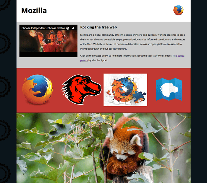
The following screenshots show what the splash page should look like after being correctly marked up, on a wide and narrow screen display.


Assessment
If you are following this assessment as part of an organized course, you should be able to give your work to your teacher/mentor for marking. If you are self-learning, then you can get the marking guide fairly easily by asking on the Learning Area Discourse thread, or in the #mdn IRC channel on Mozilla IRC. Try the exercise first — there is nothing to be gained by cheating!