我们已经在CSS模块介绍中了解过CSS盒模型 的基础知识。 本文将在这个问题上重述部分概念并且对一些知识细节进一步深入讲述。
| 前置知识: | HTML 基础(学习 HTML介绍),,明白CSS是如何工作的 (学习 CSS介绍.) |
|---|---|
| 目的: | 重述CSS盒模型的基础并掌握更多相关细节知识。 |
盒 的属性
我们都知道, 文档中每一个元素在页面布局结构中均呈现为一个矩形的盒子, 我们简化为下面这个模型:
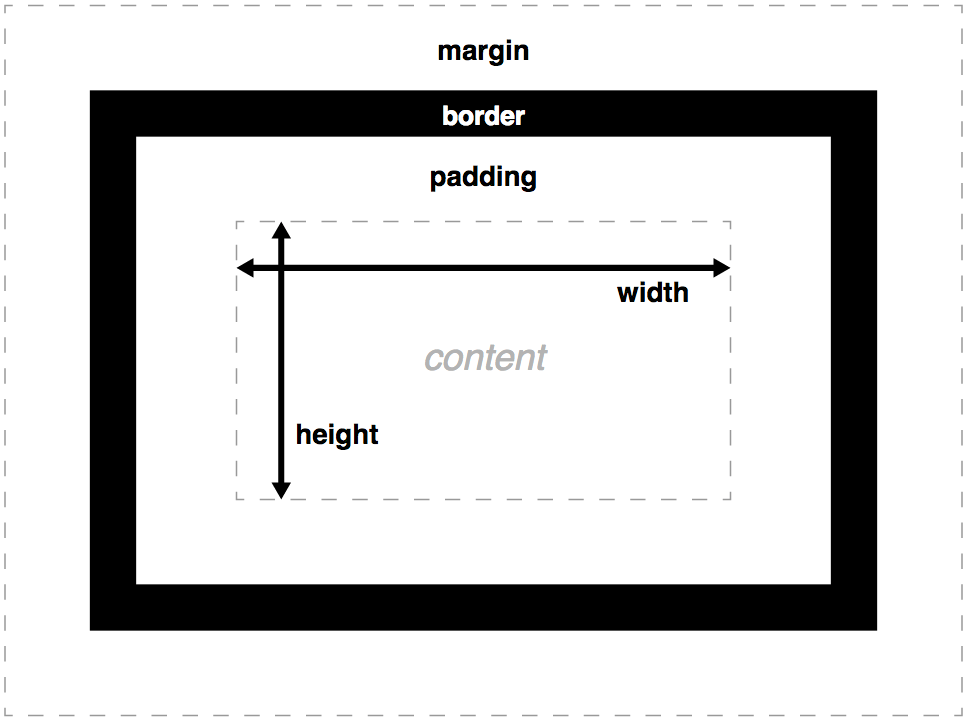
width和height设置了内容盒子的宽/高padding属性设置了盒子的内边距的宽度(具体属性比如padding-bottom,这样你就可以一次只设置一个边的内边距).border属性设置了盒子边框的宽度、样式和颜色(设置边框具体属性的参数还有很多)。margin属性设置了盒子与周围区域距离的大小,这个属性可以让其他的盒子与当前盒子产生距离(当然,这里一样有很多具体属性可用比如margin-bottom)。
其它一些值得记住的点:
- 如果盒子的高度被设置为百分比长度,那么盒子高度不会遵循这个设置了的百分比长度,而是总会采用盒子内容的高度,除非给它设置了一个绝对高度(例如,像素或者 em)。这比把页面上每个盒子的高度默认设置为视口高度的 100% 更方便。
- 边框也会忽略百分比宽度设置。
- 外边距有一个特殊的行为,称为 外边距合并: 当两个盒子挨在一起时,二者之间的距离为两个挨着的外边距中最大的那个值,而不是二者的和。
Note: See The box model article's Box properties section for a more complete overview and an example.
Overflow (溢出)
当用绝对值设置盒子的大小时(比如,固定像素的 width 和 height),内容可能会超出设置的大小,此时内容就会溢出盒子。要控制这时候发生的事情,我们可以使用 overflow 属性。 该属性有几个可能的取值,不过最常用的是:
auto:如果内容太多,那么溢出的内容会被隐藏,滚动条显示出来,从而可以让用户滚动看到所有内容。hidden: 如果内容太多,那么溢出的内容被隐藏了。visible: 如果内容太多,溢出的内容显示在盒子之外(这通常是默认的行为)。
Note: See The box model article's Overflow section for a more complete overview and an example.
Background clip (背景重叠)
Box backgrounds are made up of colors and images, stacked on top of each other (background-color, background-image.) They are applied to a box and drawn under that box. By default, backgrounds extend to the outer edge of the border. This is often fine, but in some cases it can be annoying (what if you have a tiled background image that you want to only extend to the edge of the content?) This behaviour can be adjusted by setting the background-clip property on the box.
Note: See The box model article background-clip section for an example.
Outline
盒子的 outline 看起来像边框,但是它不是盒模型的一部分。它表现得像边框,但是是画在盒子之上,不会修改盒子的大小(具体来说,ouline 是画在边框盒之外,外边距区之内)。
Note: Beware when using the outline property. It is used in some cases for accessibility reasons to highlight active parts of a web page such as links when a user clicks on them. If you do find a use for outlines, make sure you don't make them look just like link highlights as this could confuse users.
盒的高级属性
现在我们已经做了一个简单回顾,下面我们来看看一些有用的更高级的盒子属性。
设置宽和高的约束
其它一些属性可以用更灵活的方式控制内容盒的大小 — 是通过设置大小约束,而不是设置一个绝对大小。这是通过属性 min-width、max-width、min-height 和 max-height 实现的。
一个明显的用处是,如果想通过设置将一个布局的外层容器的宽度设置为百分比,从而让布局的宽度变得灵活,不过又不想让它变得太宽或者太窄,因为这样布局就开始看起来很糟糕。一个选择是用响应式网页设计技术(之后我们会讲到),但是更简单的方法也许只是给布局一个最大和最小宽度约束即可:
width: 70%;
max-width: 1280px;
min-width: 480px;
You could also couple this with the following line, which centers the container it is applied to inside its parent:
margin: 0 auto;
0 causes the top and bottom margins to be 0, while auto (in this case) shares the available space between the left and right margins of the container, centering it. The end result is that when the container is within the min and max width constraints, it will fill the entire viewport width. When 1280px width is exceeded, the layout will stay at 1280px wide, and start to be centered inside the available space. When the width goes below 480px, the viewport will become smaller than the container, and you'll have to scroll to see it all.
You can see the above example in action in min-max-container.html (see the source code).
Another good use of max-width is to keep media (e.g. images and video) constrained inside a container. Returning to the above example, the image causes a problem — it looks ok until the container becomes narrower than the image, but at this point the image starts to overflow the container (as it is a fixed width). To sort the image out, we can set the following declarations on it:
display: block;
margin: 0 auto;
max-width: 100%;
The first two make it behave like a block element and center it inside the parent container. But the real magic is in the third one — this constrains the image's width to be at the most the same size as the container, therefore if the container tries to shrink smaller than the image width, the image will shrink along with it.
You can try this modified example at min-max-image-container.html (see the source code).
Note: This technique works as far back as Internet Explorer 7, so it is nicely cross browser.
Changing the box model completely
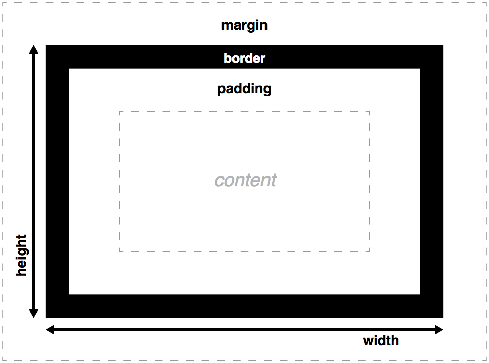
The total width of a box is the sum of its width, padding-right, padding-left, border-right, and border-left properties. In some cases it is annoying (for example, what if you want to have a box with a total width of 50% with border and padding expressed in pixels?) To avoid such problems, it's possible to tweak the box model with the property box-sizing. With the value border-box, it changes the box model to this new one:
Let's look at a live example. We will set up two identical <div> elements, giving each one the same width, border and padding. We will also use some JavaScript to print out the computed value (the final on-screen value in pixels) of the width for each box. The only difference is that we've given the bottom box box-sizing: border-box, but we've left the top box with its default behaviour.
First, the HTML:
<div class="one"></div>
<div class="two"></div>
Now the CSS:
html {
  font-family: sans-serif;
  background: #ccc;
}
.one, .two {
  background: red;
  width: 300px;
  height: 150px;
  padding: 20px;
  border: 10px solid black;
  margin: 20px auto;
}
.two {
  box-sizing: border-box;
}
Finally, a little JavaScript to measure the overall computed widths:
var one = document.querySelector('.one');
var two = document.querySelector('.two');
function outputWH(box) {
  var width = box.offsetWidth;
  var height = box.offsetHeight;
  box.textContent = 'Width: ' + width + 'px, Height: ' + height + 'px.'
}
outputWH(one);
outputWH(two);
This gives us the following result:
So what's happened here? The width and height of the first box are equal to content + padding + border, as you'd expect. The second box however has its width and height equal to the width and height set on the content via CSS. The padding and border haven't added onto the total width and height; instead, they've taken up some of the content's space, making the content smaller and keeping the total dimensions the same.
You can also see this example running live at box-sizing-example.html (see the source code).
盒子的显示类型
迄今为止我们所说的都是针对块级元素的盒子。不过,CSS 还有元素行为不同的其它类型的盒子。元素的盒子类型是由 display 属性指定的。
常见的display的类型
display 可以有很多种不同的值, 其中三种常见的值为 block, inline, 和 inline-block.
- 块盒(block box)是被定位为堆放在其它盒子之上的盒子(即盒子之前以及之后的内容出现在不同的行上),并且可以给它设置高度和宽度。上面所述的整个盒模型都适用于块盒。
- 行内盒(inline box)与块盒相反:它跟随文档的文本流堆放(即,它会与周围的文本和其它行内元素出现在同一行,并且其内容会像段落中的文本行一样,随着文本流换行)。宽度和高度设置对行内盒无效;在行内盒上的所有内边距、外边距和边框设置会改变周围文本的位置,但是不会影响周围块盒的位置。
行内块盒(inline-blockbox)介于前两者之间: 它会像行内盒一样,跟随周围的文本流堆放,不会在其前后创建换行;不过,它可以像块盒一样,使用宽度和高度设置大小,并且维护其块完整性 — 它不会跨段落行换行(对于一行文本容纳不下的行内盒,会落到第二行上,因为第一行上没有足够的空间容纳它,并且不会跨两行换行)。
块级元素默认设置为 display: block; ,行内元素默认设置为 display: inline; 。
Note: See The box model article's Types of CSS boxes section for a more complete overview and an example.
不常见的display类型
There are also some less commonly-used values for the display property that you will come across in your travels. Some of these have been around for a while and are fairly well supported, while others are newer and less well supported. These values were generally created to make create web page/application layouts easier. the most interesting ones are:
display: table— allows you to emulate table layouts using non-table elements, without abusing table HTML to do so. To read more about this, See CSS tables.display: flex— allows you to solve many classic layout problems that have plagued CSS for a long time, such as laying out a series of containers in flexible equal width columns, or vertically centering content. For more information, see Flexbox.display: grid— gives CSS a native way of easily implementing grid systems, whereas it has traditionally relied on somewhat hack-ish CSS grid frameworks. Our CSS Grids article explains how to use traditional CSS grid frameworks, and gives a sneak peek at native CSS Grids.
What's next
After a quick little recap, we looked at some more advanced features of CSS for manipulating boxes, and finished up by touching on some advanced layout features. With this all behind us, we will now go on to look at backgrounds.